
OVERVIEW
Boasting one of the highest profit margins in the S&P 500 with low customer churn and acquisition cost, Public Storage, the world’s most prominent self-storage company, was looking to update its software management tools and develop an easy-to-use point-of-sale system. The Santa Monica agency Phelps* had worked with the client for over three years before I was asked to join the project. They were struggling to make significant progress in developing their point-of-sale system.
*As of 2018, the Phelps agency has joined the agency 9thWonder.
PROJECT
Product Design, User Experience, UI Design
Product Design, User Experience, UI Design
ROLE
Designer, UX Strategist
Designer, UX Strategist
GOAL
Help Public Storage design a user-friendly manager and point-of-sale system.
Help Public Storage design a user-friendly manager and point-of-sale system.
Getting Started
The Phelps agency initially asked me to help add branding elements to existing designs. Based on my previous branding and development experience, I was brought on as a visual and interactive designer. With no brief or design set in stone, Phelps pointed me to some wireframes and a brand color palette. I decided to build upon what was already created.
agency wireframe
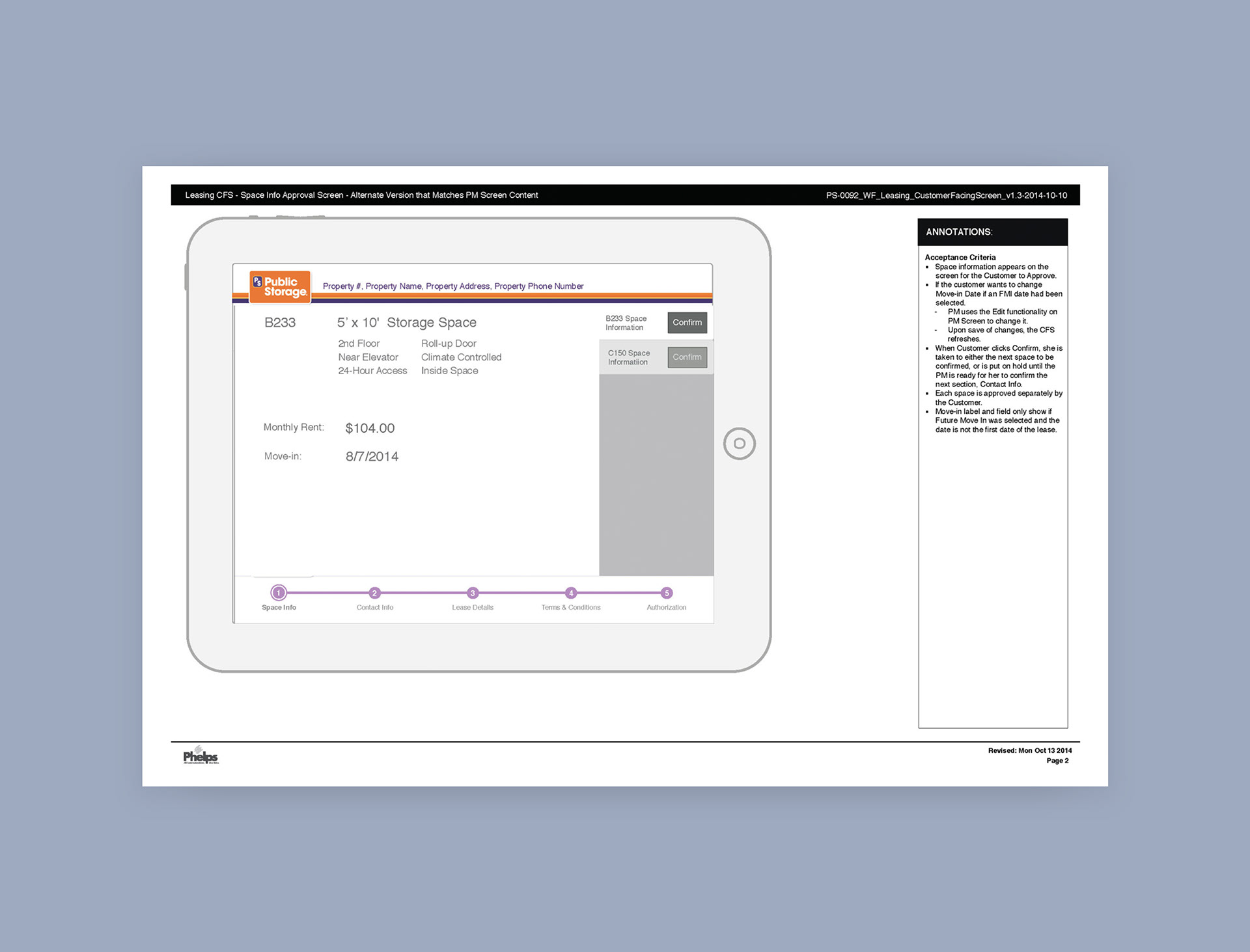
agency wireframe (continued.)
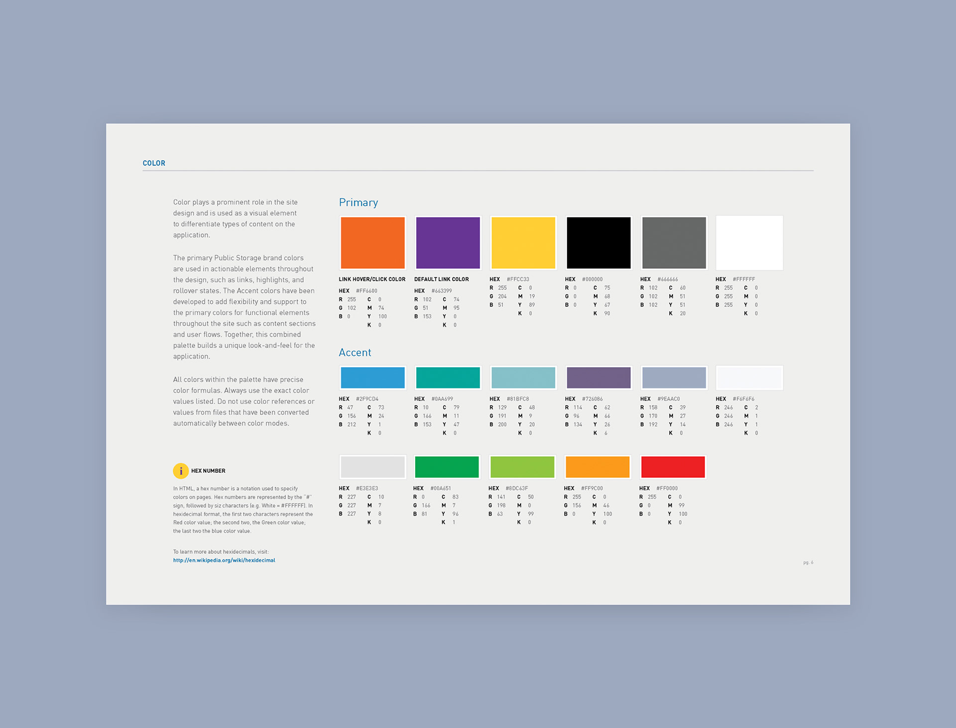
brand colors guideline with additional UI colors
DIVE DEEP
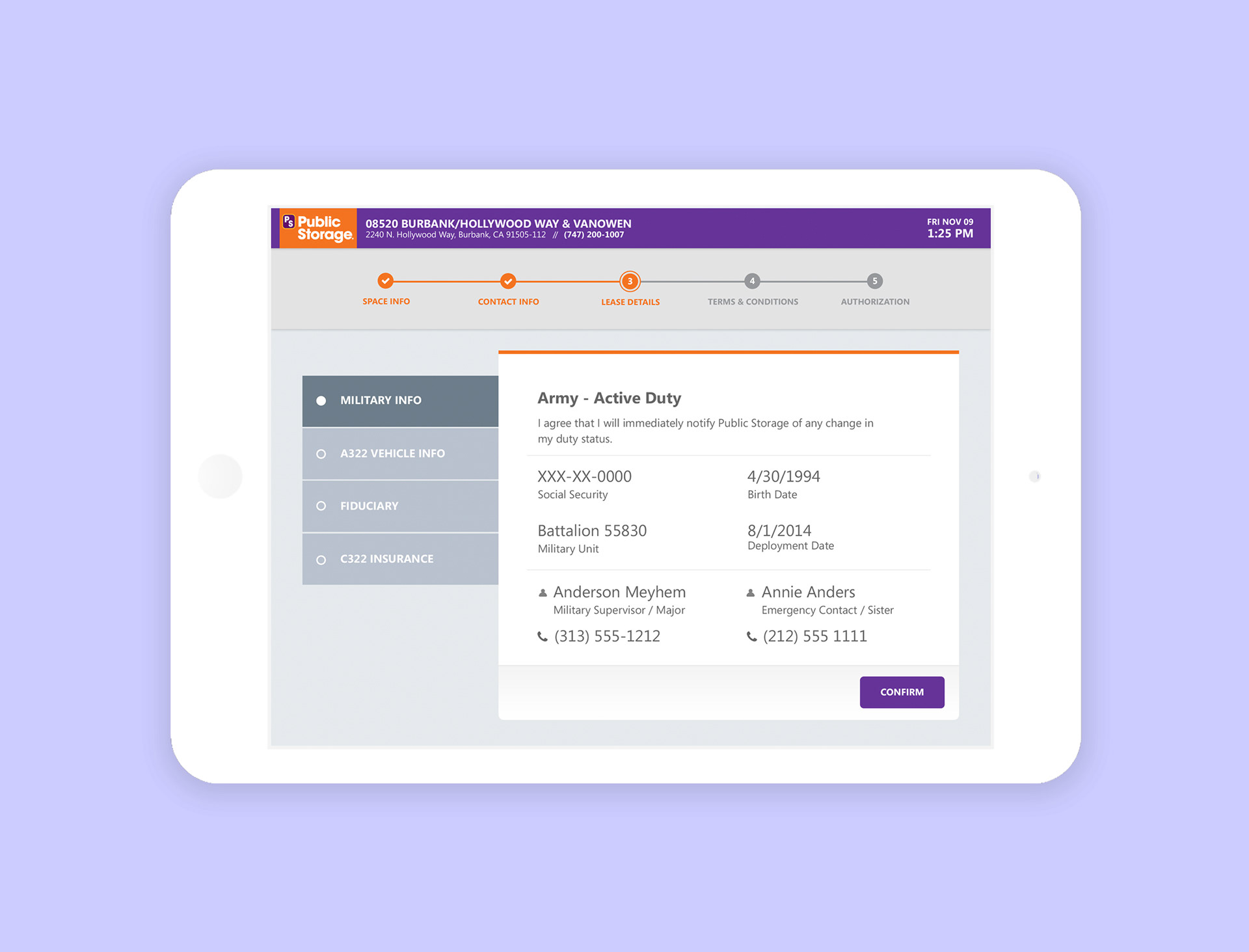
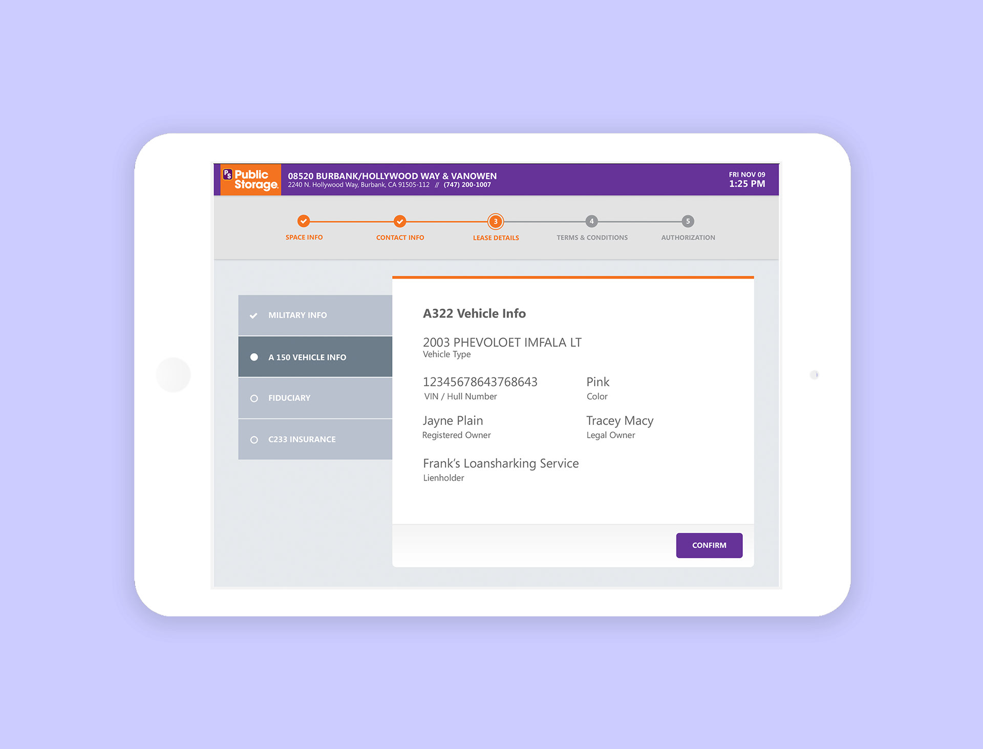
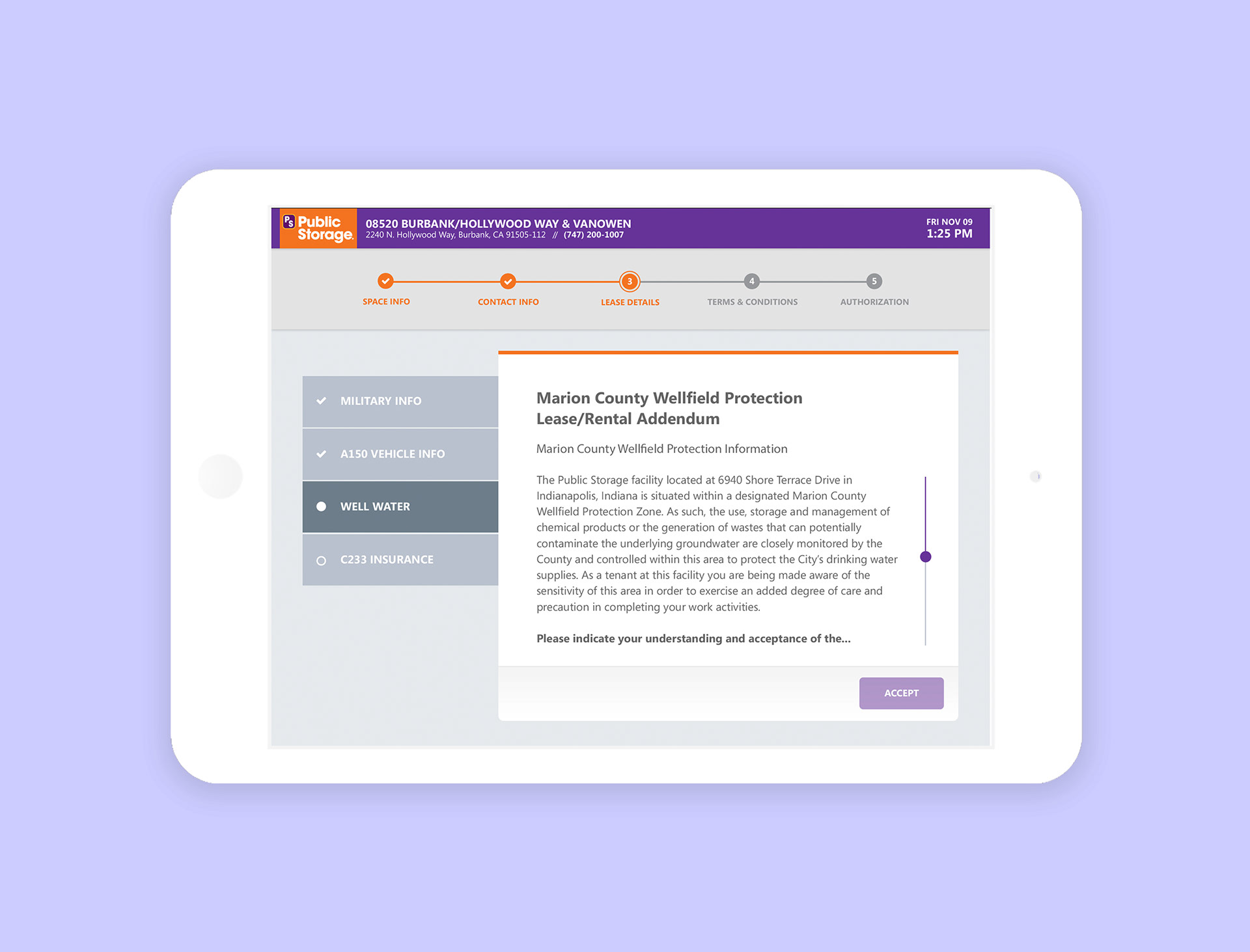
First, I scoured the internet to download as much information as possible about the client and their audience; I searched for every advertisement, service review, and blog I could find. Then, I walked around the agency and asked people about the client. I found out that Public Storage had a broad consumer base that ranged from the ages of 18 to 65. I also learned that the customer-facing UI had to be simple enough for any new employee to guide a customer due to the high turnover rate of property managers. After work, I decided to visit a public storage location to see what it was like to be in a facility.
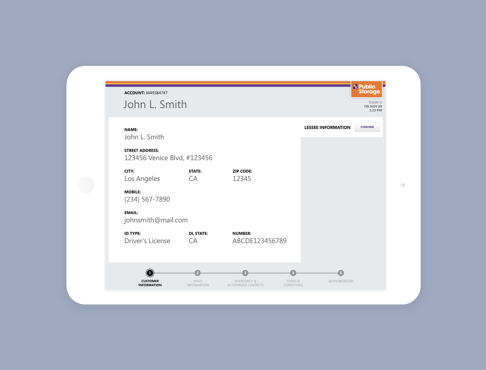
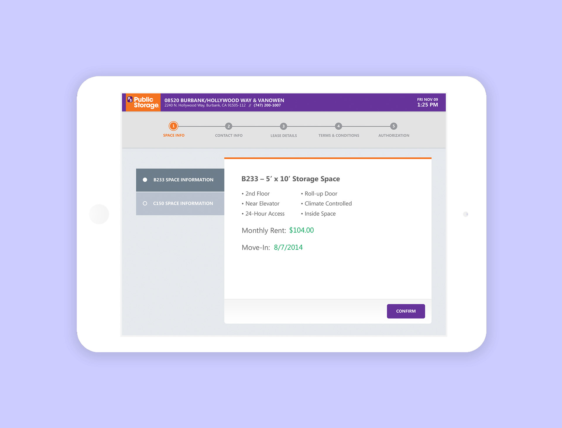
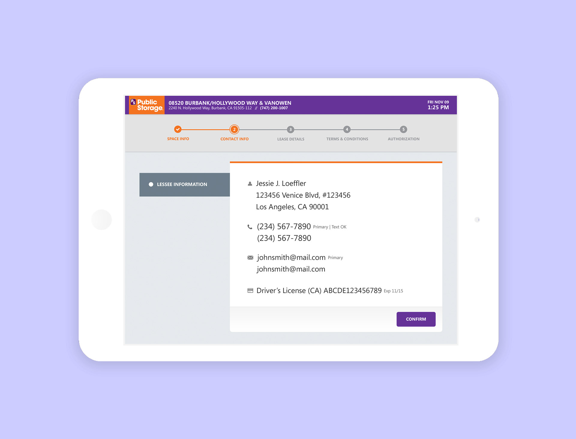
agency wireframe (left) update wireframe (right)
PROJECT INFLUENCE
From previous conversations, I knew that I was expected to skin the preexisting designs. I became curious about the last design decisions as I developed new comps. I asked myself why the main navigation was at the bottom of the screen. Was there a quantitative reason for this? It opened up a load of questions. I thought back to a project I had in Detroit, where I had the opportunity to work with Quicken Loans* before launching the fintech product Rocket Mortgage. Rocket Mortgage is a fast, powerful, and completely online way to get a mortgage for refinancing or buying a home. Quicken Loan had invested heavily in human-centered design. With over a decade of user research, usage metrics, and product refinement, they’ve learned to understand their core users deeply.

*Quicken Loan was once owned by Intuit, the company behind TurboTax, QuickBooks, and Mint.
One of the takeaways from Rocket Loan that stuck with me was how the system posed questions to users. It was all about giving users bite-size information while guiding them through a sequence. I began thinking about how to apply what I had learned to Public Storage. How might we design a point-of-sale system with minimum property manager intervention?
GOING BEYOND THE ASK
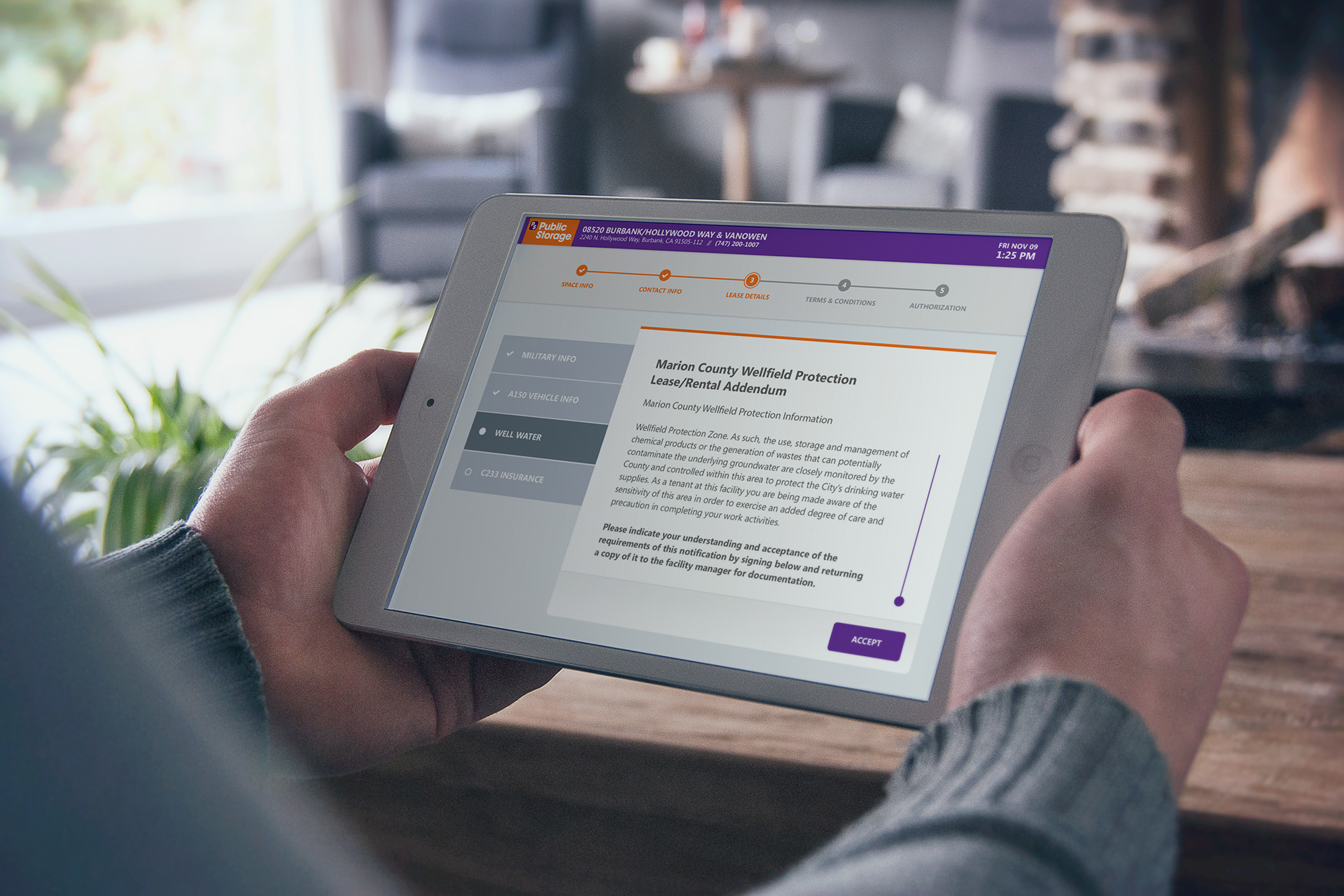
With the broad range of users in mind, I continued to ask questions and push the design to the potential I believed it could be. I placed a jpeg within an iPad to simulate the experience and did a qualitative test around the office and home.
After I made some compelling points about user experience, design, and consistency, the agency agreed to have me present my iterations to the client.

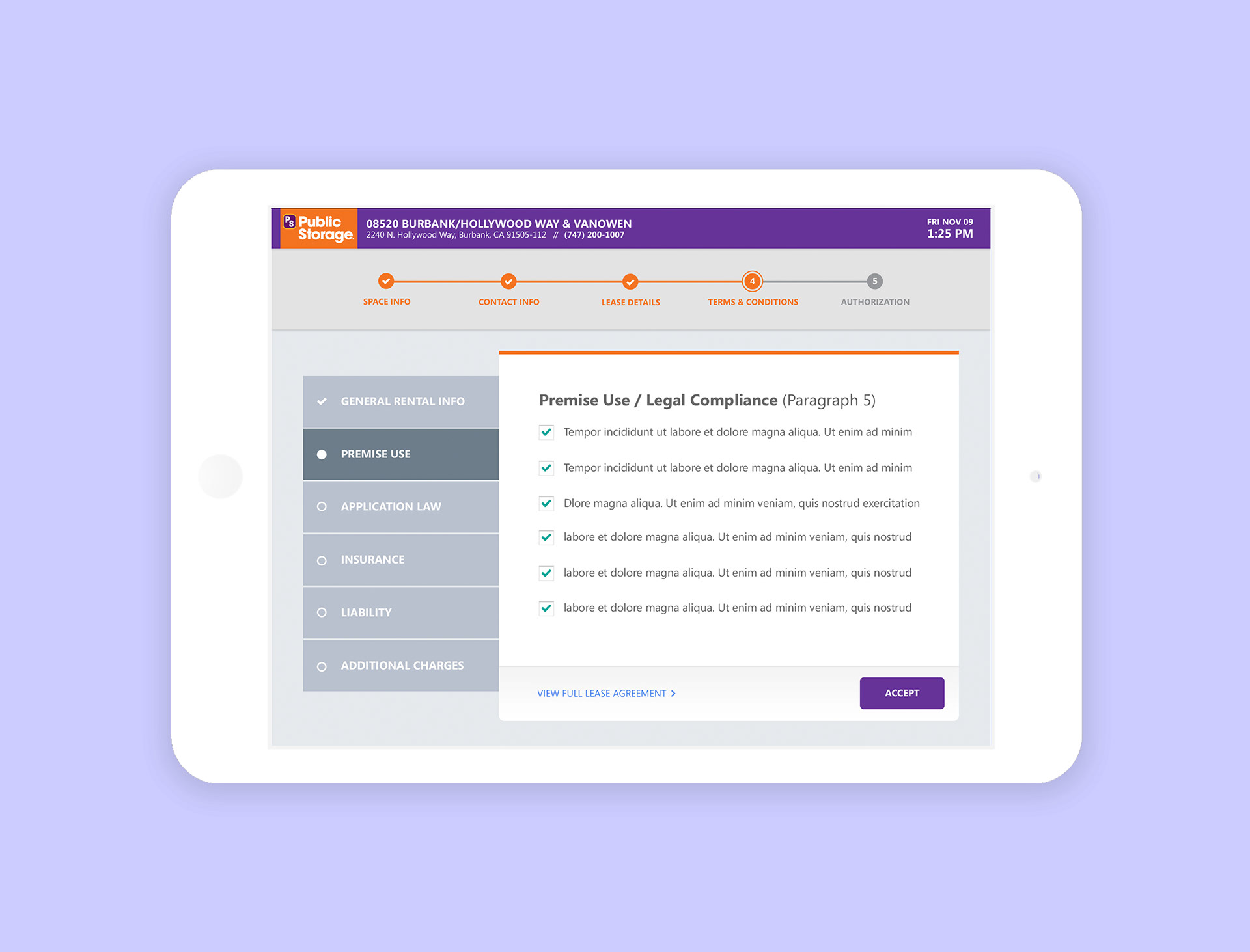
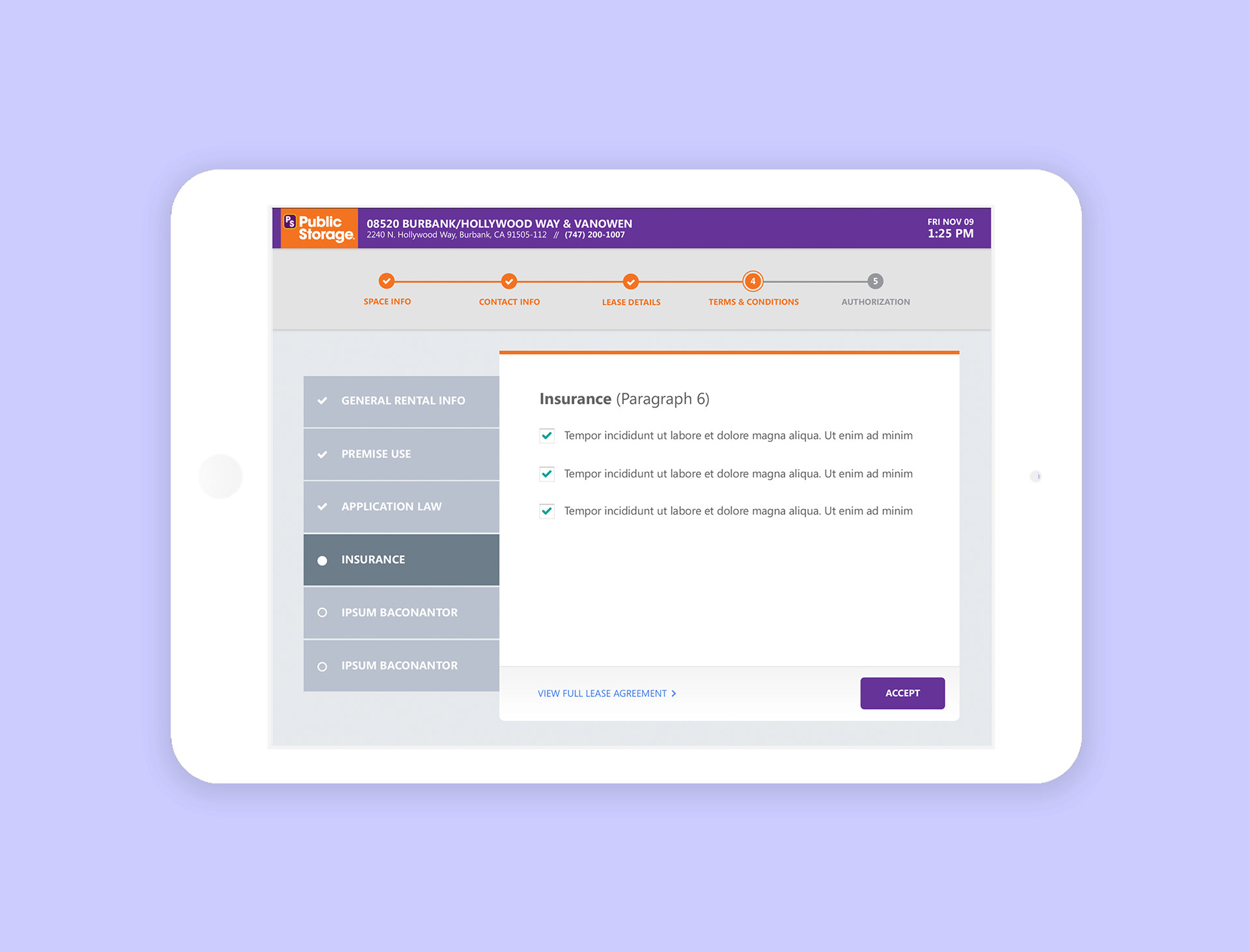
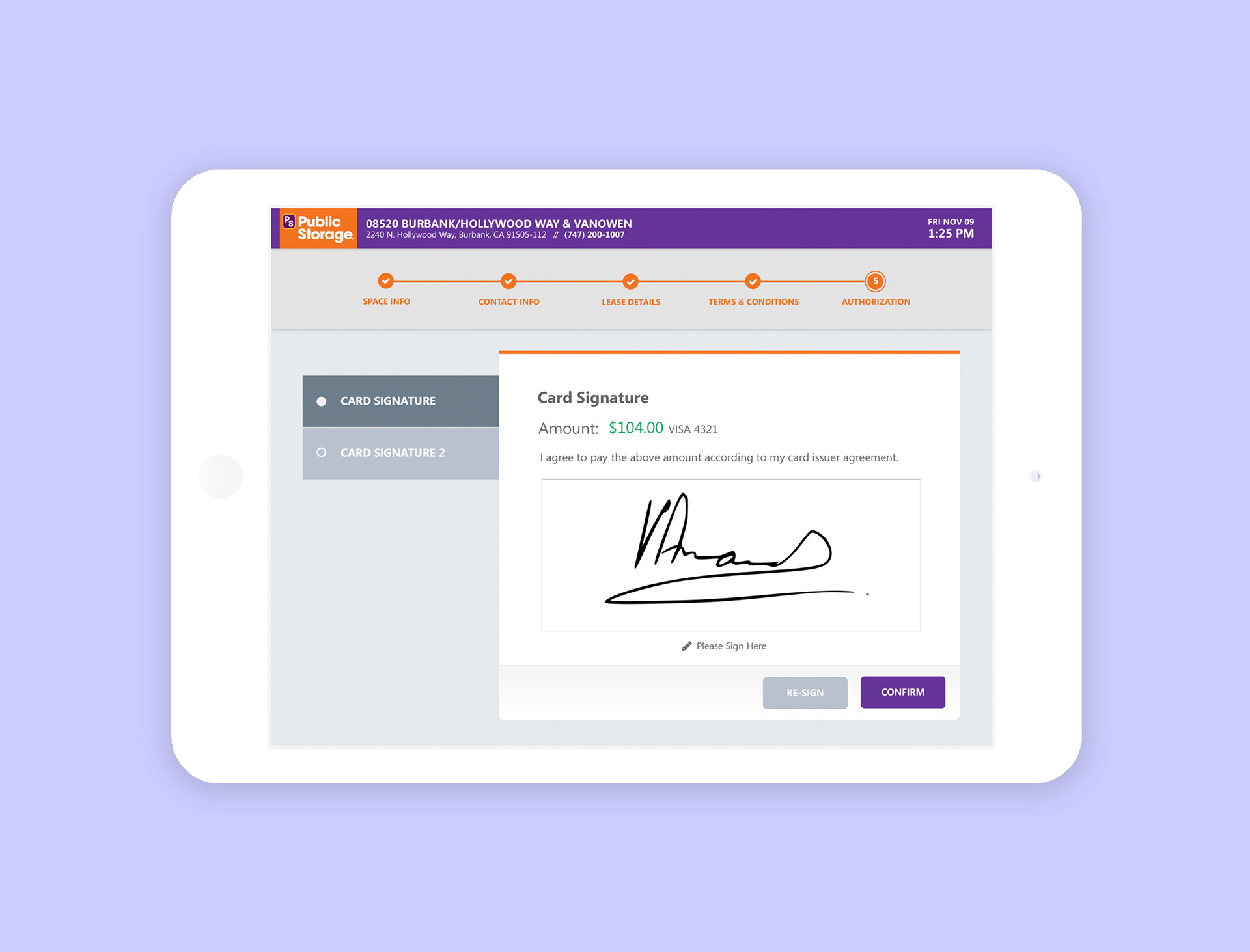
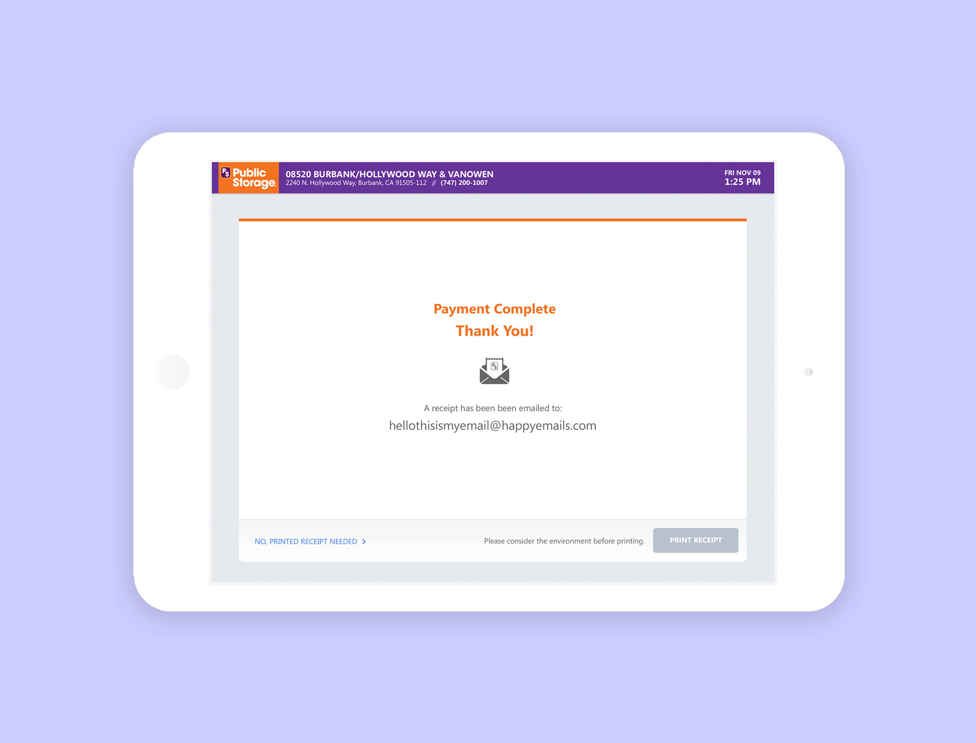
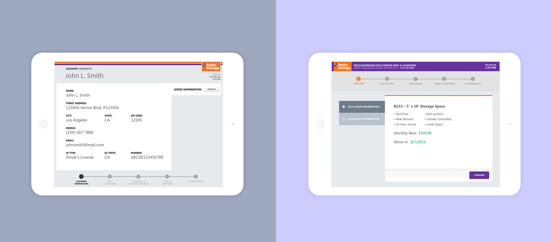
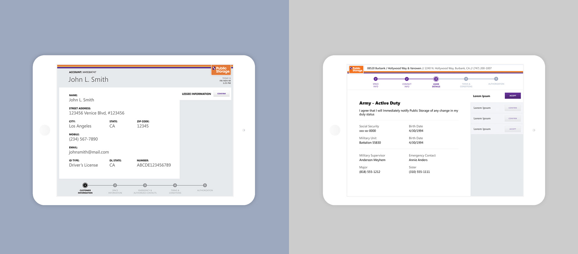
original agency wireframe (left) client approved UX/UI concept (right)
RESULTS
Public Storage loved the approach. My alternative design was selected and now runs nationwide across all 2,666 locations. During that year, Public Storage grew its on-site conversion rate from 1.2% to 7.5%, making over $2.561B, a 7.51% increase from 2015.

VIEW NEXT PROJECT: REMY MARTIN: ONE LIFE/LIVE THEM CAMPAIGN
Want to see more? Check out my archive of previous projects. For additional info, email me at biz[at]dimitrialexander.com